Small Spaces, Part III: Japanese Ideas for Small and Tiny Homes
This is the third of a series by architect and long-time Japan resident Azby Brown, the author of Small Spaces: Stylish Ideas for Making More of Less in the Home. In these excerpts from that seminal book, he offers some timeless advice on how to incorporate ideas used by Japanese architects in any kind of home, no matter how tiny.
Bringing the Exterior into the Interior to Broaden Horizons
For making a room feel less confining and more spacious, probably no other design device is as effective as providing a visual connection to the outdoors, what we will call here "bringing outside in." While this can take a bewildering variety of forms, the only constant, essential feature to keep in mind is that while seated inside, one must have the sense that the outdoors are nearby and easily accessible.
For homes in constricted locations, this generally means providing a small garden that can be viewed from inside through a window of some sort. Alternately, the "view" can be of scenery in the near distance, or a small patch of sky. Even man-made scenery, such as an attractive nearby building, can be used as an aesthetic foil to draw one's attention outside. It is also possible to use a small piece of outdoor space in such a way as to suggest the presence of a view where none actually exists.
All photos by Yoshio Shiratori; all drawings by the author.
Accessibility and Greenery
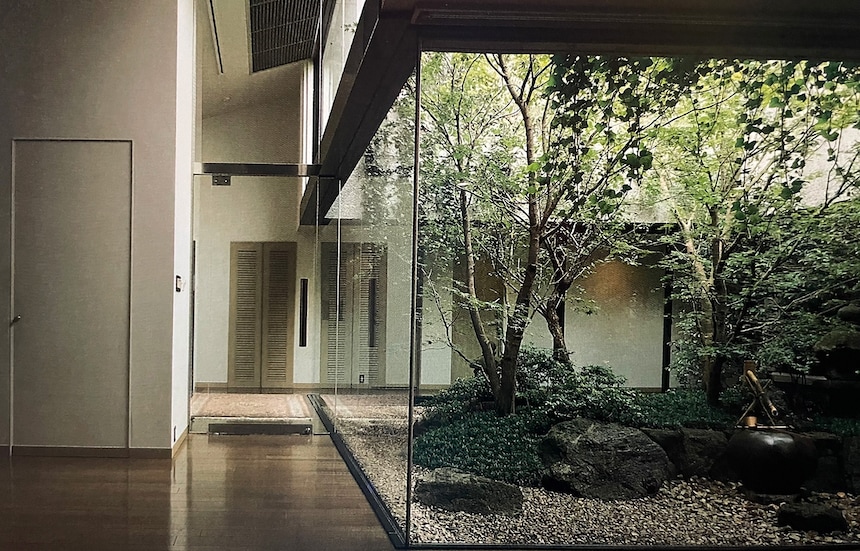
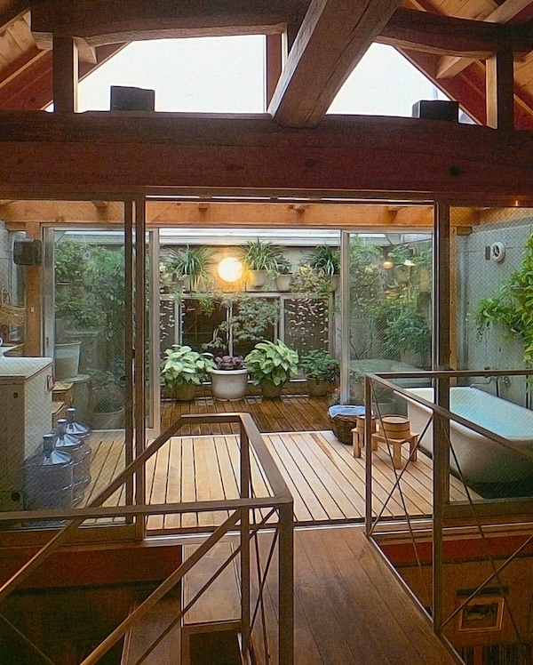
This second-story space has a fine southern exposure and is given great depth and variety by being divided into three levels: the inside (kitchen), a glass-roofed intermediate zone (bath/laundry), and a terrace open to the sky (garden).
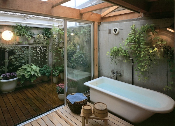
In this example, light enters both from above and through the gable-end windows, which lend extra drama to the rustic wood beams, here based on traditional farmhouse design. Although the house is flanked on either side by taller structures, enough privacy is maintained to place the bathtub halfway outdoors. Potted plants serve as a garden; a wire-mesh arbor has been provided for vines, which will eventually create a pleasant green ceiling for shade during the summer. (By Tsutomu Abe)
Ideally, there should be greenery. Better still, the "garden" should be accessible, large enough to enter. At the same time, one should remember the power of suggestion: it isn't necessary to install floor-to-ceiling picture windows in order to "connect" inside with out. A small window, maybe shaded, even placed higher or lower than normal, is usually more effective increating the illusion of an adjoining space so expansive that to show it all would be overpowering.
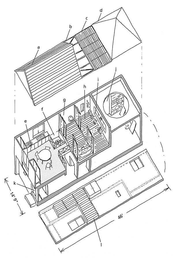
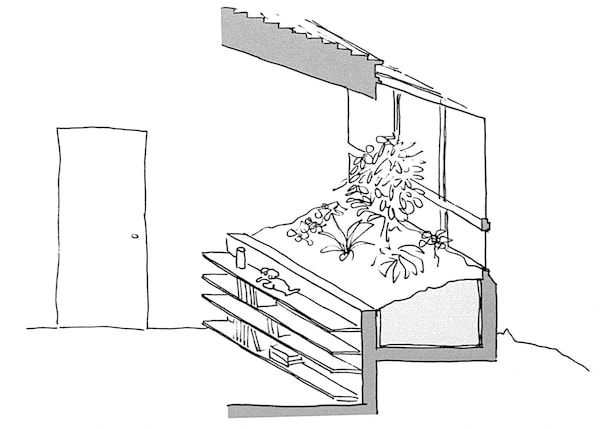
Floor plan for the townhouse shown in the images above, with an "indoor courtyard": a) wood-frame roof, b) glass roof, c) trellis, d) concrete roof, e) kitchen/dining, f) stairway, g) glassed-in bath/laundry, h) courtyard/garden, i) window, j) open to sleeping/living space below, k) entrance, I) bookshelves.
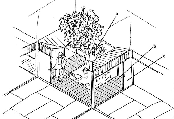
Miniature "half-mat" garden: a) garden, b) roofed verandas, c) sliding panels close off surrounding space.
Some of the most effective "outside-in" designs involve actually letting the living space wrap around a small piece of outdoor space, giving the effect that the outside is actually penetrating the indoors [as in these photos]. In Japan, this was often done through the use of a small garden called a tsuboniwa, or "half-mat" garden, sort of a sheltered, very small, nook of greenery the size of as mall closet (above).
A small greenhouse like this can take advantage of balcony or window space; raising it to waist height allows room for shelves or seating in front while making the gardening less of a back strain.
Nowadays, a similar effect might be obtained through a small enclosed balcony with potted plants (above) and a glass door.

This small light well is more like a display case for nature: it could be made into a planted garden, or house a sculpture. Sliding doors at the back provide physical access, allow cross-ventilation, and connect separate living areas visually while mainta
A small light well of some sort (above) is another solution.
Letting In What One Wants to See
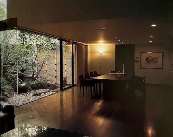
This strikingly verdant living space is on the fifth floor of a building tightly hemmed in on all sides by even taller office blocks in downtown Tokyo.
While the floor space of this apartment (above) is ample, its midtown environs create a feeling of cramped quarters, which is cleverly overcome by the garden at the center. If the garden were much larger, one would become aware of the surrounding skyline; as it is, it is large enough to be entered, and has enough variety to reflect seasonal changes. While the detailing of this apartment is fairly modern in the international sense, the layout of the space, particularly the manner in which the main living areas and the corridor on the opposite side wrap around the garden, derives from Japanese residential tradition. Gardens like this would normally be located deep within the home and shown only to special guests, but here, the outdoor space is the focal point of the entire home, and is visible from the moment one enters. The old, slow revelatory discovery is replaced by a thoroughly modern "bang-pow!!" (By Shimizu Corporation, Design Division)
Of course, nothing is wrong with providing an entire wall which can be opened and closed at will. All the better if the room can be thus "opened" at the corner. The problem with this in many situations is that it might let in a lot of unwanted scenery -- telephone poles, garbage cans, the neighbors' bathroom window. But even less attractive views can be improved with clever framing and masking. Every gardener knows the trick of hiding the neighbors' driveway with high hedges; if anything, this sort of thing is easier in small spaces, where the garden itself is likely to be shallow and will probably be seen from only one position. The view or field of vision, can be likened to a stage set; the key is to occupy it with what one wants to see, and hide what one doesn't, all the while remembering that a few items placed in overlapping layers, the tallest in back, with maybe one thin tall element placed to one side in front, can create a surprising illusion of depth and distance. Just give the eye somewhere to wander. Even a "garden" no more than two feet deep, set in the narrow space between houses, can be extremely effective in multiplying interior space.
Working in a Narrow Lot in a Residential Neighborhood
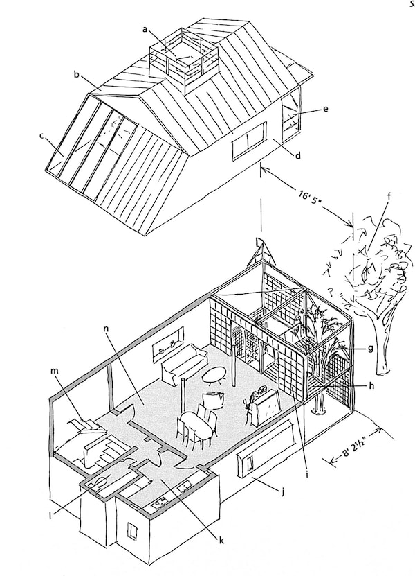
This single-family house is located in a typically dense Tokyo residential neighborhood.
The designer/occupant of this single-family home, Hisao Koyama, recognized that the narrow lot would allow flexibility and light only at the front and rear, and opted to create a patch of green at the front. Borrowing a few points from traditional Kyoto-type townhouses, and a few others from the English variety, Koyama placed the main living space on the second floor behind a screened, layered garden. A stand of bamboo is allowed to rise from the ground through an opening in the steel-grating balcony; additional green is "borrowed" from a large tree outside the property line. The entire front wall of the room is glass and can be closed off by sliding screens, which allow the shifting shadows of the leaves and structure to play upon their white background. Components include: a) roof platform, b) roof, c) skylight over stairs, d) children's bedrooms, e) balconies, f) large tree, g) bamboo, h) balcony/deck, i) layered wall, j) bathroom, master bedroom, study on ground floor, k)kitchen, I) toilet/lavatory, m) stairway, n) living/dining.
Articles in this series cover more practical examples of ways Japanese architects have used these concepts in interesting and innovative ways. Some of the features covered include:
Part I: Horizontality, Lighting and Color Patterns
Part II: Living Low and Level Change
To come:
Wise Use of Space: Under stairs, floors, etc.
Clever Storage Ideas
Make the Most of Your Kitchen Space
About the book, "Small Spaces: Stylish Ideas for Making More of Less in the Home"
Small Spaces was released 30 years ago. In the years prior to this, a number of English-language books dealing with the design of both contemporary and historical Japanese houses had become available, and several became invaluable sources for specialists and academic readers. For the general audience, some provided advice on how to integrate shoji, tatami, and other Japanese features into Western lifestyles. Small Spaces was different from all of these. That Japanese homes were by necessity more compact than their Western counterparts was noted from time to time in writing about Japanese architecture aimed at the West. But this was almost invariably considered a “quirk” derived from a unique cultural and economic context, often amusing, sometimes clever.
Small Spaces, on the other hand, made the case that many people in other countries already needed the kind of compact living space ideas that had become common in Japan, and that in coming decades the need would only increase. This was clearly prescient. Back in the early 90’s, the Japanese architectural and lifestyle press was awash in the kinds of hints and space-maximization techniques that found their way into Small Spaces. I sensed that a convergence was occurring, and that people abroad were ready to live more like the Japanese. The book highlighted how people actually lived, focusing less on the work of starchitects and more on designers who worked to solve problems for average households.
The book’s approach was part technical, part perceptual, and part philosophical, and stressed how many seemingly new design ideas are rooted in Japanese tradition. This was, of course, decades before Mari Kondo. More significantly, what has become known as the “Tiny House Movement” was beginning to emerge. Small Spaces was frequently cited as a pioneering design sourcebook for compact design, by Stewart Brand, for instance, in How Buildings Learn of 1994, and in The Not So Big House by Sarah Susanka in 1997.
My later book, The Very Small Home, released in 2005, garnered even more international attention, undoubtedly thanks to exposure on the internet, which had emerged in the interim. Small Spaces thankfully remains in print after 30 years. Some of the designs presented in the book have aged better than others, but the underlying principles remain vitally important.
Amazon US
Amazon Japan
Amazon UK