An Inside Look into Japanese Graphic Design
Have you ever seen an advertisement or poster and thought: “Wow, that looks very Japanese”? There is just something about Japanese design and the unique sense of style. Lucky for us, Mary Stribley, a writer for graphic design website Canva‘s Design School, compiled a list of 10 common elements of Japanese graphic design. Let's see what they are!
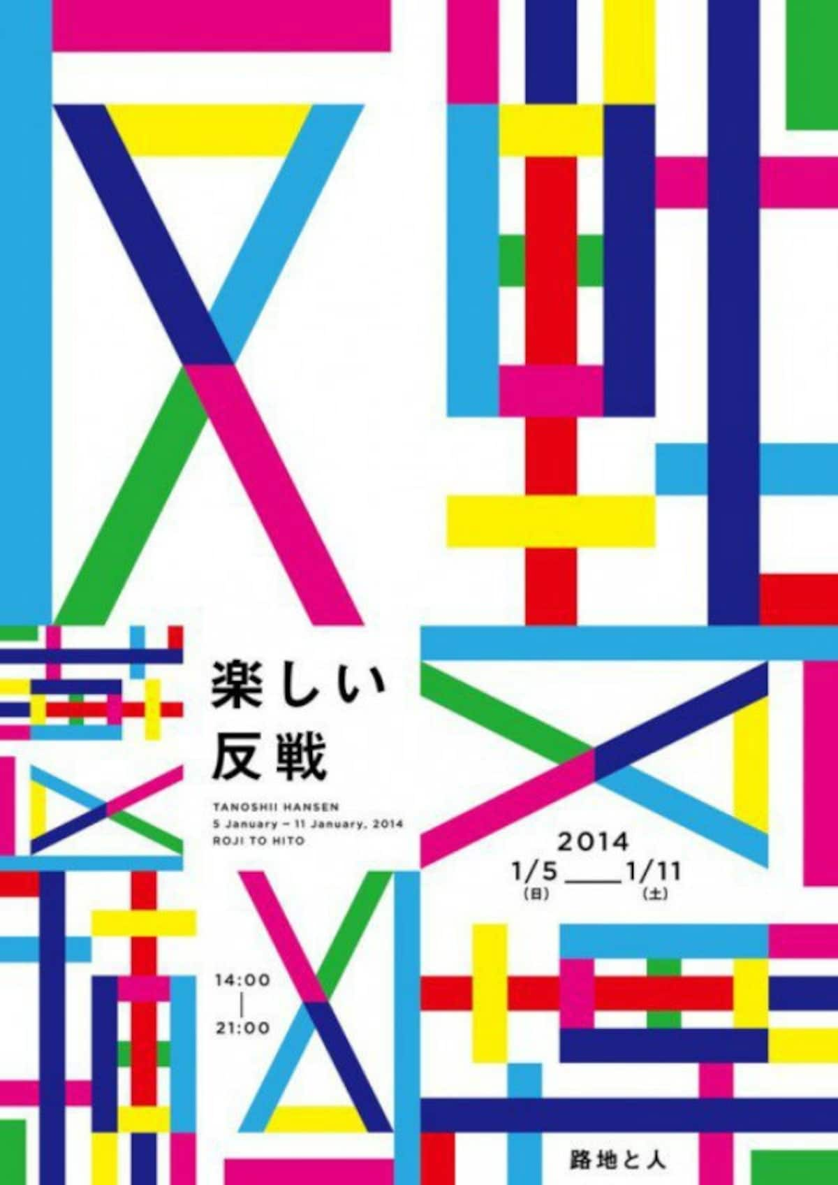
By SoraNews241. Bright Colors

http://en.rocketnews24.com/2016/02/09/ten-common-characteristics-of-japanese-graphic-design/
If you’ve spent any time people watching or window shopping in Tokyo, this one should come as no surprise. The bold clash of colors extends past fashion into the paper world too.
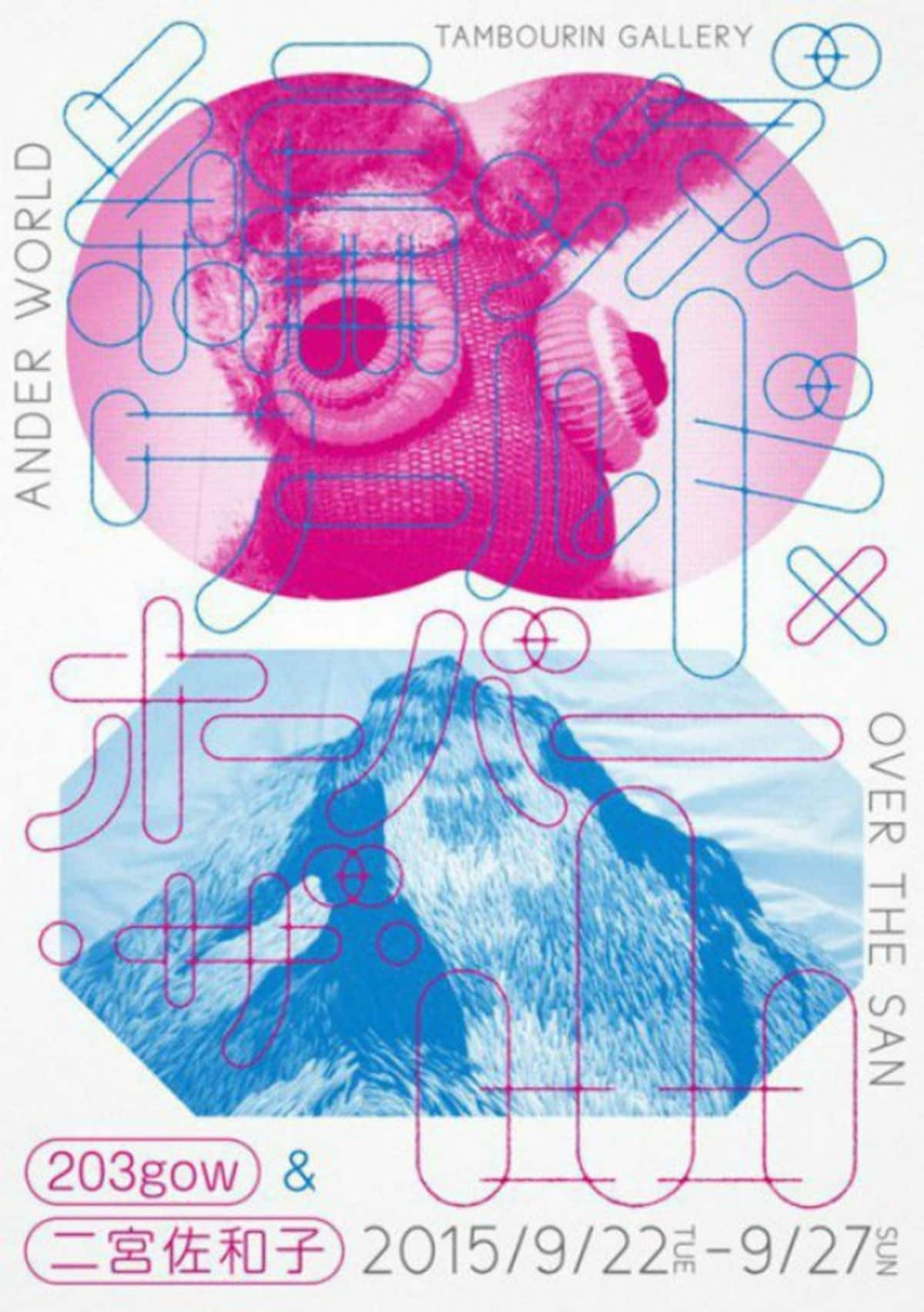
2. Mixed Languages

http://en.rocketnews24.com/2016/02/09/ten-common-characteristics-of-japanese-graphic-design/
Despite English being a dreaded subject for many a student, Japanese design often features English words, especially on T-shirts. Although the English may not always be correct or appropriate, it looks cool, especially when intermingled with any of the three Japanese scripts.
3. Custom Typography

http://en.rocketnews24.com/2016/02/09/ten-common-characteristics-of-japanese-graphic-design/
It could be said that the controversy over the 2020 Tokyo Olympics design was merely due to two designers’ affinity for a certain pre-fab typography, however, many Japanese graphic designers don’t face that issue because they just make their own from the start. You won’t be finding the unique typeface seen above in any templates.
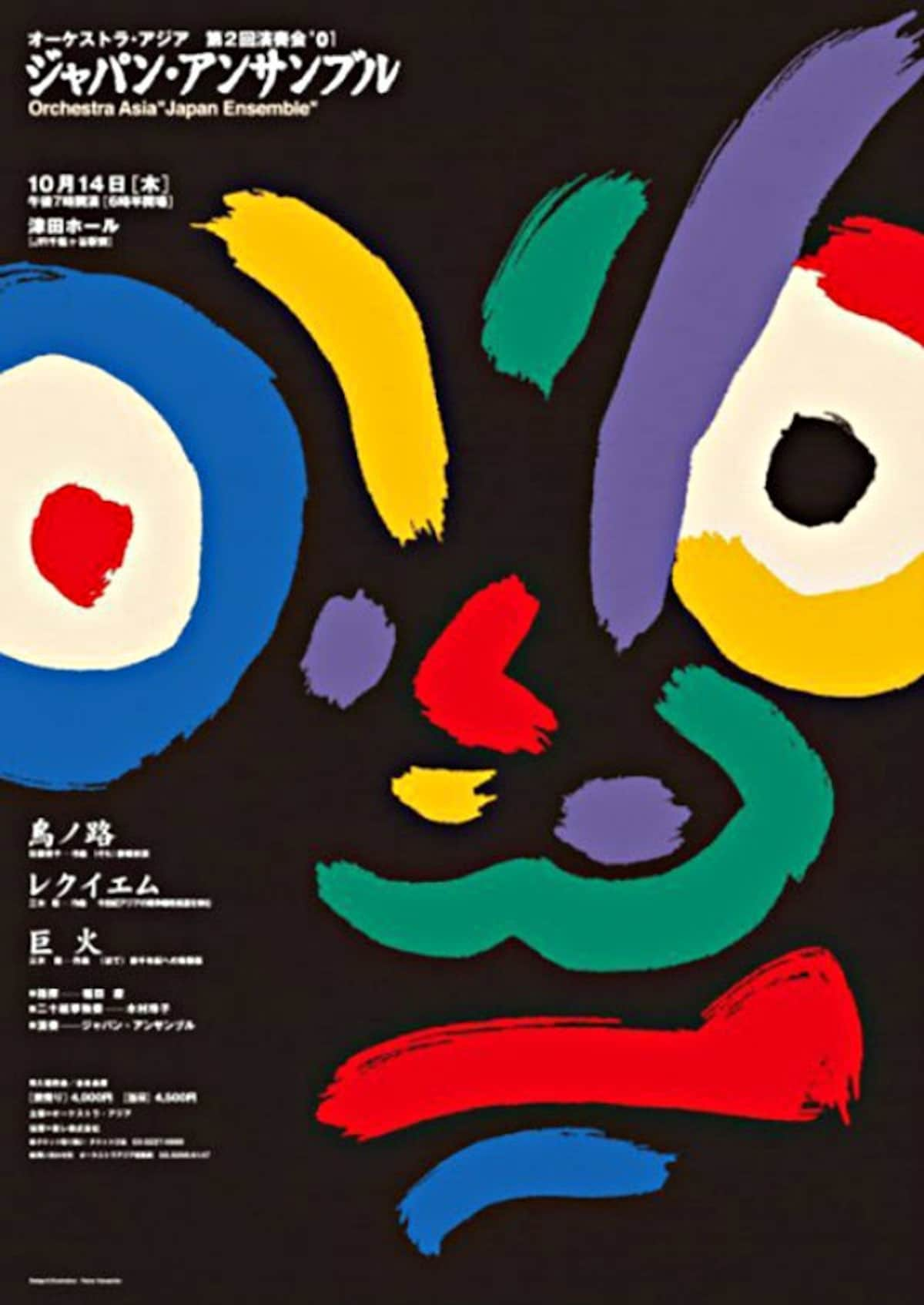
4. Brush Strokes

http://en.rocketnews24.com/2016/02/09/ten-common-characteristics-of-japanese-graphic-design/
A deep-rooted part of Japanese culture is calligraphy, known as shodo in Japanese. Kids start studying shodo in school in first grade, but many choose to continue to practice after that, aspiring to reach “master” level on a grading system similar to that of martial arts. Needless to say it’s no joke, and shodo, with its characteristic brush strokes, has found a place in the graphic design world.
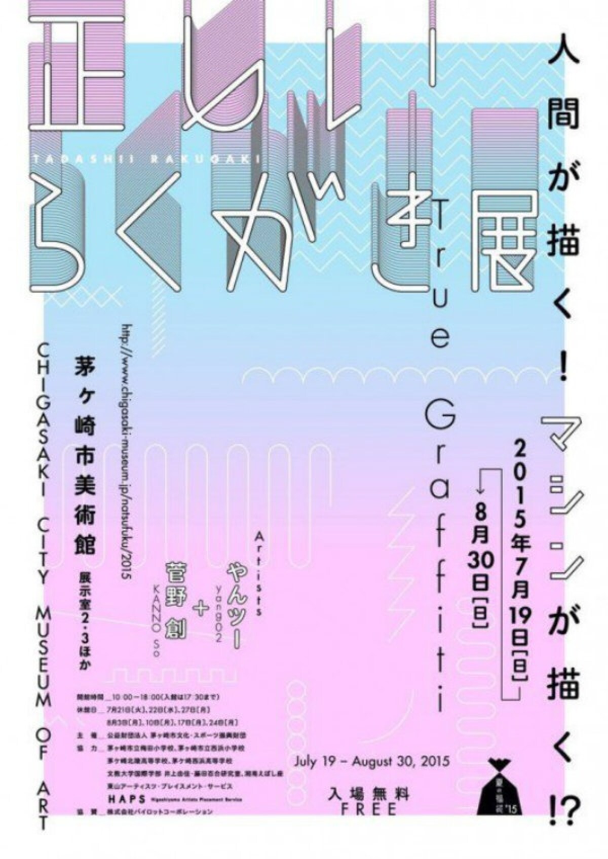
5. Gradients

http://en.rocketnews24.com/2016/02/09/ten-common-characteristics-of-japanese-graphic-design/
Ombré is on the up-and-up in both fashion and hair design, but the gentle transition between colors is quite the popular tool in Japanese graphic design as well, often seen in both full-page fading, like above, and also as a technique for font coloring.


